Fintech
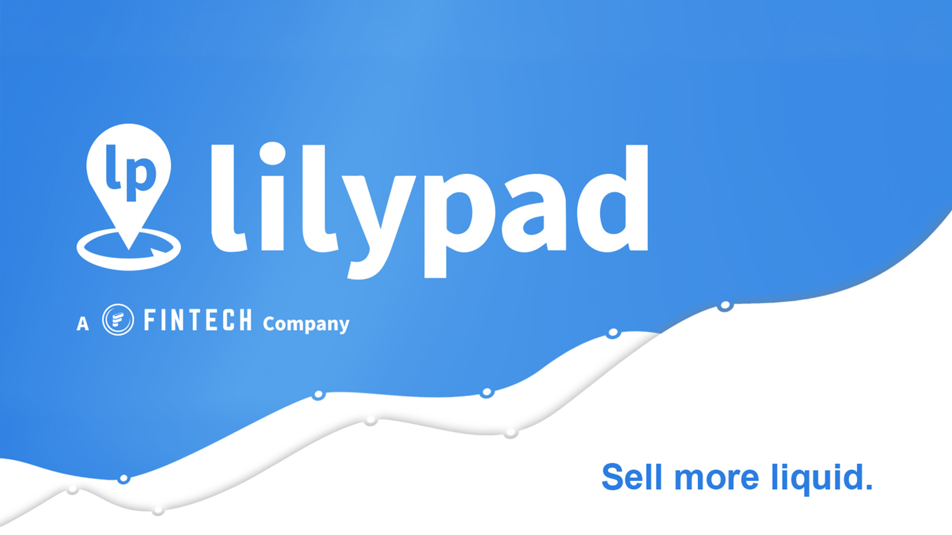
Modernizing a first-of-its-kind payment and data solution for the beverage alcohol industry
UI/UX
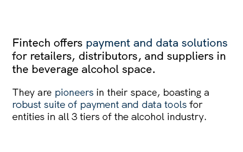
Fintech is the leading business solutions provider for the beverage alcohol industry in the United States and offers beverage alcohol payment and data solutions for suppliers, distributors, and retailers.
Process
I felt it important to take an inventory of brand elements and ensure the strategy in place was in line with the exciting leaps the company was making into new sectors. However, it was equally important not do this at the cost of alienating long-time supporters of their Payments solution. Extensive inventory of UI, visual elements, and digital products, combined with polling and interviewing users helped steer explorations. I created moodboards and stylescapes, and conducted comparative analysis of competitors in the space.
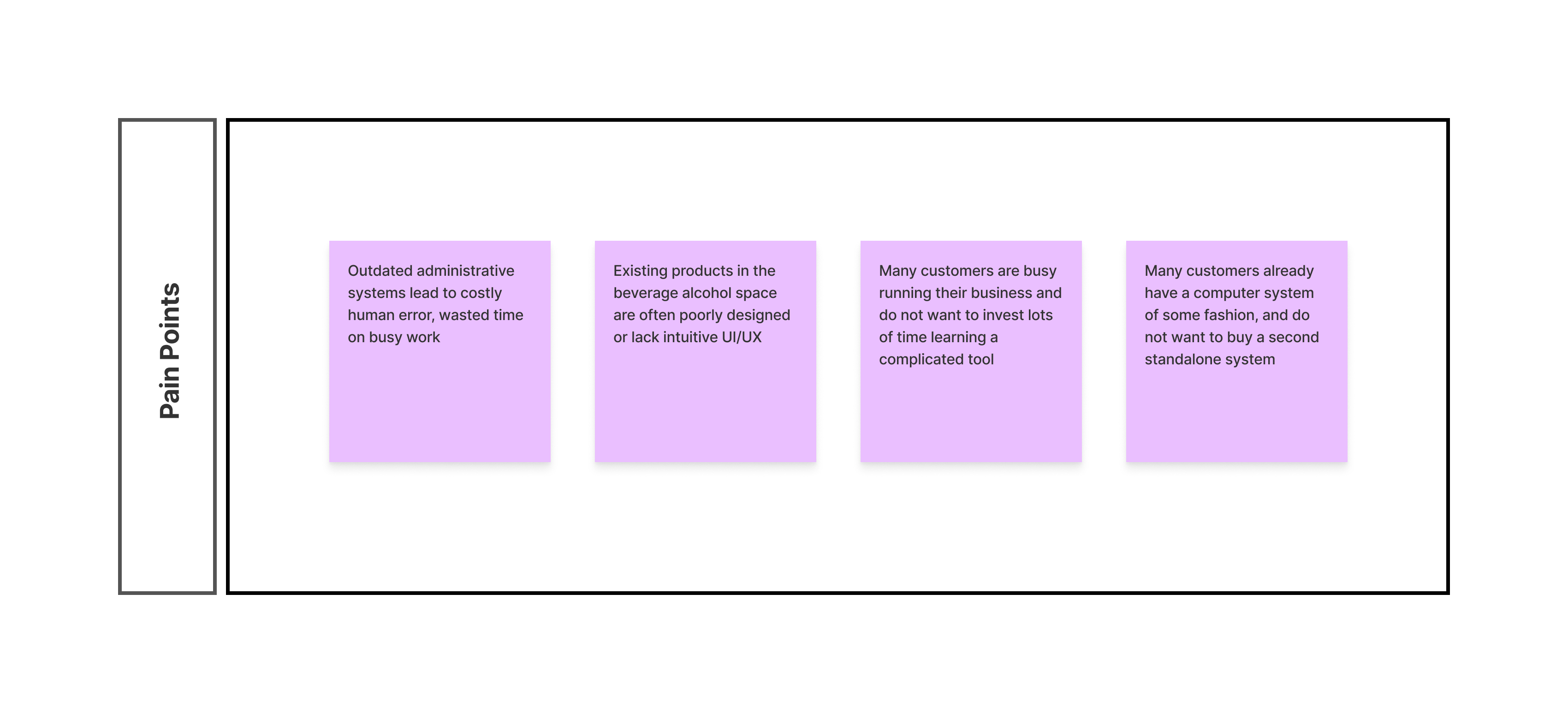
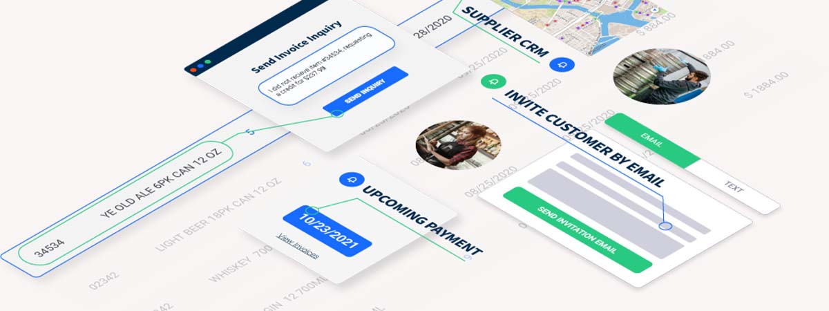
A stark contrast existed between the "old" and "new" in this project, and it was critical to seek out user opinions to find any commonalities that would offer an inroad between the two. We organized workshops based on collected user data; this helped to eliminate bias and begin to recognize some long-held assumptions that no longer served the brand. One common theme was a lack of clarity surrounding some of the features of the product, as well as confusion around who the company was and what they did. We decided a series of product illustrations could be a good way to demonstrate the functionality of the company's different products in an easy-to-understand way; I began coordinating with the product team to plan which features to call out and begin iterating on these concepts.
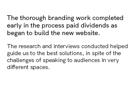
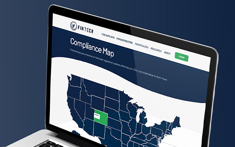
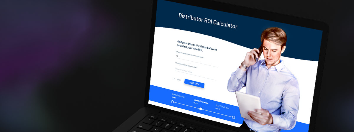
With the new strategy in place, focus turned to the website redesign. This stage involved a significant amount of planning, as the redesign was to be completed by a team of two - myself, and the Marketing Director. A daunting task to be sure, but with the aid of project management tools, and organizing the work into sprints, we were able to chart a course for ourselves to meet the executive team's desired deadline. The team had decided on a no-code solution due to time and budgetary constraints; I built reusable page templates and content blocks that could be easily converted from wireframes into a high fidelity prototype.
My reusable blocks from the previous step came in handy as we began to style the pages. This approach allowed the Marketing Director and I to collaborate interchangeably on all aspects of the build, since no special programs or coding knowledge was required. With the help of the product team, we finalized the illustrations and implemented them throughout the design. We launched on schedule and quickly began to see positive results in terms of traffic, keyword rankings, and lead generation.

-
The Challenge
The client's image had failed to evolve with its advances and acquisitions in the data sector. We needed to refresh the brand to reflect these new, sophisticated offerings and ideas without alienating the existing base of small business owners, shop managers, gas station owners, and so on who had been faithful to the brand for years.
-
Services ProvidedBrand Identity
- Strategy & Messaging
- Brand Personality
- Visual Identity
Website Design- Information Architecture
- Wireframing
- Live Prototyping
- Developer Handoff
Marketing Collateral- Experience Design/ Trade Show
- Social Media Design
- Email Design
-
The ResultsWebsite Performance
- Overall traffic increase + 400% QOQ
- Record number of marketing leads after launch
- Improved brand visibility
- Improved accessibility flaws in previous color scheme